光与硅 —— 数字成色原理与 Lightroom 调色
Table of Contents
想在具体进入lumen-nuro 项目之前先介绍下基本的成色原理, 以及通过lightroom来介绍调色的逻辑 这篇文章不会牵扯过多的胶片的内容, 但会在之后的文章里解说 作者:Weiyi | 项目仓库:github.com/Waye/Lumen-Neuro | 状态:M2 完成(2026-06-02, commit dd3cba1),arXiv 预印包就绪
序:先问一个奇怪的问题
打开 Lightroom,你会看到几十根滑块。大部分教程会告诉你"这根往右拉画面变亮",然后你照做,画面确实变亮了。
但很少有人问:为什么是这几根滑块?
为什么白平衡只有两根而不是三根?为什么曲线面板底下要专门放一根叫"精修饱和度"的东西?为什么相机校准里会突然冒出一个只管暗部的滑块?为什么所有教程都说"先调曝光再调色"——这是习惯,还是有别的原因?
这篇文章想说明的是:每一根滑块都不是设计师随手放的,它们各自在解决一个具体的问题。 而这些问题往上追,最后会追到同一个地方——人的眼睛。
看懂了这条链路,你不需要背任何参数。
第一部分 · 颜色是什么
1. 「三」是眼睛的数字,不是光的数字
先破除一个最常见的误解。
太阳光里有无穷多种波长,光谱是连续的,红到紫之间没有任何断点。所以"世界上有三种基本的颜色"这句话,在物理上是错的。
那三从哪来?
从眼睛来。人的视网膜上只有三种视锥细胞,分别对短、中、长波长敏感。任何射进眼睛的光,不管成分多复杂,最后都被压缩成这三个细胞的三个信号值。
这个压缩是不可逆的。两束成分完全不同的光,只要三个信号值相同,你就看成同一个颜色——这叫同色异谱,也是所有显示技术能成立的根本原因。
屏幕只用三种灯就能骗过你,是因为它只需要凑对三个数。
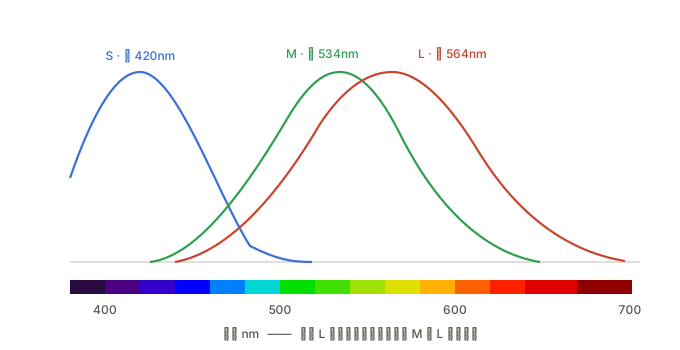
这张图里有两件反常识的事。第一,所谓的"红"锥细胞(L)峰值在 564nm,那其实是黄绿色,根本不在红色区。第二,M 和 L 两条曲线重叠得极其厉害——人对红绿的分辨,靠的是这两条曲线之间的差值,而不是各自独立的响应。
换句话说,“红绿蓝"这三个名字本身就是后人贴上去的近似标签。
光做加法
屏幕上每个像素是三颗自己发光的灯。舞台底色是黑的,因为黑就是"没有光”。每往上推一格,就是往画面里注入一份光。
加法滑块 = 光的强度
三盏全开,所有波长齐了,就是白光。
颜料做减法
颜料反过来。白纸把所有波长都反射回来,所以底色是白的。每加一层颜料,就从这束白光里吃掉一段波长:
| 颜料 | 吸收什么 | 也就是关掉哪个通道 |
|---|---|---|
| 青 C | 红光 | R |
| 品红 M | 绿光 | G |
| 黄 Y | 蓝光 | B |
减法滑块 = 颜料的浓度
三色叠满,三段波长全被吸收,接近黑。
说"接近"是因为真实油墨做不到完美吸收,CMY 叠满出来是浑浊的深褐色——所以印刷才要额外加一版黑墨,凑成 CMYK 的 K。
美术课的"蓝加黄等于绿"和物理课的"蓝光加黄光等于白光",两句话都对。 它们根本是两种不同的操作。这个矛盾在历史上让人吵了一百多年。
2. 同一个颜色,两个地址
RGB 不是描述颜色的唯一方式。
RGB 像直角坐标——三条边定位一个点。而 HSL 把同一个空间掰成圆柱:色相是绕轴的角度,饱和度是离中轴的距离,明度是高度。
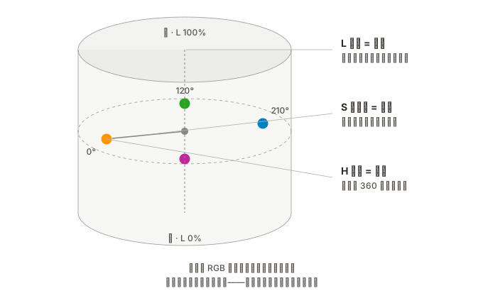
下面这个可以直接拖:
拖左边任意一根,右边跟着动;反过来也一样。两组数字始终指向同一个色块——它们不是两种颜色,是同一个颜色的两种写法。
为什么要有两套坐标? 因为有些操作在一套里简单,在另一套里几乎做不到。
想把颜色整体"转个方向",在 HSL 里就是拖一根滑块;在 RGB 里你得同时算三个数,而且算出来的关系毫无规律。反过来,想让画面整体变亮,RGB 里三个数一起乘就行。
两套坐标没有优劣。Lightroom 的不同面板选了不同的坐标——选哪一套,取决于那个面板想解决什么问题。
试试把饱和度拖到 0——点会滑到中轴上,那条从黑到白的灰轴。再把明度拖到 0 或 100,整圈色环会塌成全黑或全白:在圆柱的顶和底,所有色相和饱和度的组合都指向同一个颜色,坐标全浪费了。这是 HSL 最大的结构缺陷,后面还会遇到它。
3. 发现史:每一步都只对了一半
“三是眼睛的数字"这个结论,人类花了三百年才得到,而且路上每一步都错了一半。
| 年份 | 发现了什么 | 同时错在哪 |
|---|---|---|
| 1666 牛顿 | 白光是复合的;颜色不在光里,是一种感觉 | 硬凑成七色去对应音阶;认为每个波长同样基本,没得出「三」 |
| 1720s 勒布隆 | 三色套印可行;察觉颜料与光的方向相反 | 选了红黄蓝;说不出为什么,矛盾悬置一百年 |
| 1801 杨 | 视网膜不可能对应无穷波长,必然只有少数通道——推断是三种 | 纯推理,零证据;原色先猜红黄蓝,后改红绿紫,两次都不准 |
| 1850s 亥姆霍兹 | 加法与减法正式分家:颜料做减法,光做加法 | 三色理论解释不了残像,也说不清为何没有「偏红的绿」 |
| 1860s 赫林 | 补上对立过程理论,红-绿、蓝-黄成对拮抗 | 与三色说互斥了几十年,后来才知两者是视觉的前后两级 |
| 1861 麦克斯韦 | 色度可量化;拍出第一张彩色照片 | 当时乳剂对红光不敏感,红色底片本不该成像——1961 年才查明是紫外线撞了大运 |
| 1868 杜奥隆 | 提出 CMY,各自吃掉一个 RGB 通道 | 印刷业仍沿用红黄蓝几十年,色域白白窄了一截 |
| 1964 | 显微分光光度计首次测到三种视锥细胞 | 距杨的推理已隔 163 年 |
最大的错误其实是同一个: 从牛顿到勒布隆,所有人都在问「光里有什么」。1801 年托马斯·杨把问题改成「眼睛能分辨什么」,答案才浮出来。
他的推理很漂亮,而且完全没有实验:光谱波长有无穷多种,视网膜不可能为每一种准备一种细胞,生理上做不到。但人只用三种光就能配出几乎所有颜色——说明接收端的通道数很少。 他猜是三个。
一百六十三年后,显微镜才证实了他。
至于为什么偏偏是 R、G、B——通道数是眼睛定的,选哪三种光则纯属工程取舍:挑三个分得够开的波长,把色域三角形撑到最大。狗只有两种锥细胞,鸟有四种,它们的答案和我们完全不同。
第二部分 · 一张照片就是一堆三个数字
4. 万能钥匙
屏幕上每个像素点,说到底只是三个数字:红多少、绿多少、蓝多少,每个从 0 到 255。
(255, 0, 0) 是纯红,(0, 0, 0) 是黑,(255, 255, 255) 是白。一张 2400 万像素的照片,就是 2400 万组这样的三个数字。
所以「修图」这件事,本质上只有一件事:按某种规则去改这三个数字。
而所有规则,归根到底只有三种基本玩法:
| 三个数字的… | 决定了 | 对应 HSL 里的 |
|---|---|---|
| 平均高度 | 明暗 | L 明度 |
| 最大和最小的差距 | 鲜艳程度 | S 饱和度 |
| 谁大谁小的排序 | 是什么颜色 | H 色相 |
这三条不是比喻,是能写成式子的。设三个数里最大的是 、最小的是 :
明度就是最大和最小的中点;饱和度正比于两者的差距——除以总量,是为了让明暗不影响它。
差距为 0 时分子是 0,饱和度就是 0——那就是灰色。 这就是为什么灰色"没有颜色”:三个通道完全相等,分不出谁多谁少,连"是什么颜色"这个问题都无从问起。
记住这把钥匙。下面每个面板,你都只需要问一句:它在动哪一样?
5. 管线:为什么顺序不能乱
在拆面板之前,还有一件事必须先讲——Lightroom 面板在界面上的排列顺序,不是它们的执行顺序。
它是非破坏性的:你调的每根滑块都只是往一张"指令单"上记一笔,原始文件一个字节都没动。真正渲染时,按下面这条固定管线跑一遍:
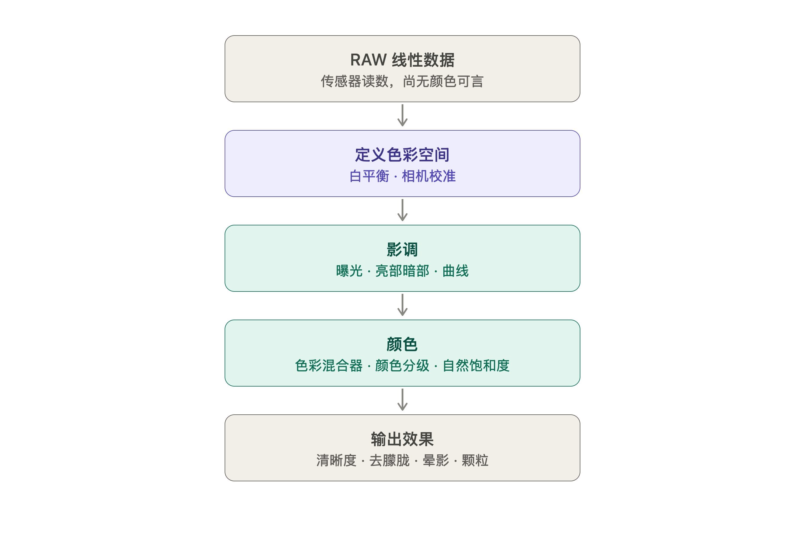
为什么必须是这个顺序? 三条理由,一条比一条重要。
① 先校准,再动手。 白平衡和相机校准是在确定"这些数字到底代表什么颜色"。这就像做实验前要先校准仪器——标准不对,后面所有测量都是错的。
② 先明暗,再颜色。 这条是硬约束,而且有数学原因。
后面会证明:改明暗会顺带改变饱和度(因为三个数字被拉开了)。所以顺序只能是:
先把明暗定下来 → 此时颜色已经被顺带改动了 → 再调颜色,把它修到你想要的样子
如果反过来——先精心调好颜色,再去动曝光和对比度——刚调好的颜色会被破坏一遍,等于白做。
所有修图教程都说"先调曝光再调色",这不是习惯,是数学上的先后依赖。
③ 装饰放最后。 晕影模拟的是镜头暗角,颗粒模拟的是胶片质感,它们都属于"拍摄时就存在的物理现象"。放在中间的话,后面的曲线会把晕影再加深一遍,锐化会把颗粒放大成噪点。
下面就按这条管线的顺序走一遍。
第三部分 · 还原真相(管线上游)
管线最上游那几个工具有个共同点:它们做的都不是创作,是修错。
要修的错有三个来源——光源不对、相机不准、传感器有毛病。而它们各自需要一种不同的数学运算。
6. 白平衡:先把尺子校准
问题
相机拍下的三个数字,严重依赖当时的光线。同一张白纸,黄昏灯光下拍红色数字偏高,阴天拍蓝色数字偏高。
如果尺子本身是歪的,后面量什么都不准。
设计
白平衡做的事很简单:给三个数字各乘一个系数,让本该是白色的东西重新变回中性。
写成矩阵会更清楚:
注意非对角线上全是 0。 这个形式叫对角矩阵,含义是:红只影响红,绿只影响绿,通道之间没有任何串扰。记住这一点,下一节马上会用到。
目标是让中性灰物体成像后满足 。
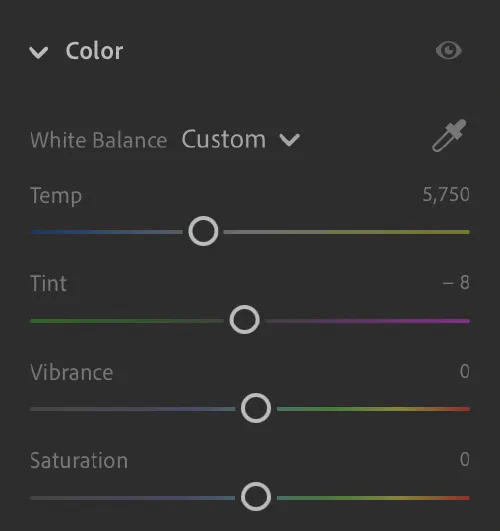
为什么只要两根滑块
看起来明明是三个未知数 ,为什么界面上只给两根滑块?
因为存在一个约束:整体亮度缩放不影响色彩。
假设把三个增益同时乘以常数 :
三个数的比例完全没变,只是一起变大了。画面整体变亮或变暗,但"偏不偏色"这件事一点没动。而整体明暗已经交给曝光滑块管了。
所以三个增益里有一个维度是白给的:
用数学的话说:三维向量空间里,如果只关心方向不关心长度,自由度就只剩二维。
顺带一提,Photoshop 的"色彩平衡"给了三根滑块(青-红、品红-绿、黄-蓝)。看着更全面,其实是冗余的——三根同时拉满,颜色回到原点,只是画面变亮或变暗了。三根里只有两根是独立的。Lightroom 只给两根,是更诚实的设计。
为什么是蓝-黄和绿-品红
两个独立方向,任选两个不平行的就行。为什么偏偏是这两个?
因为现实世界的光就是这么分布的。
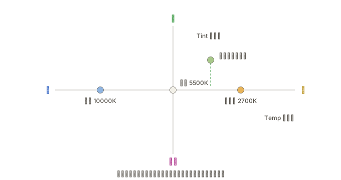
人类用的光,基本都是"把东西烧热"得来的。任何物体加热后发光的颜色只跟温度有关:红 → 橙 → 黄 → 白 → 蓝白。蜡烛 1800K、白炽灯 2700K、日光 5500K、阴天 7000K、蓝天 10000K——全都在这一条线上。
这就是 Temp 轴。它对应一个真实的物理量,所以单位是开尔文。
但有些光不是烧出来的——荧光灯、部分 LED 靠气体放电发光,光谱带尖峰,会明显偏绿;水下和树荫下的光也偏绿。这些光源落在色温轴之外,而它们偏离的方向恰好是绿-品红。
这就是 Tint 轴。它没有物理单位,因为它只是"偏离了多少"。
| 滑块 | 通道层面在做什么 |
|---|---|
| Temp 蓝↔黄 | 把 B 和 R+G 对着拉 |
| Tint 绿↔品红 | 把 G 和 R+B 对着拉 |
为什么黄色对应"R+G"?因为黄光就是红光加绿光——回想加法混色那个 demo,红圈和绿圈的重叠区正是黄色。所以**“加黄"和"减蓝"是同一个操作**。同理品红是红加蓝,“加品红 = 减绿”。
任何中性光源的色偏,都能分解到这两个轴上:
- 偏橙 = 往黄 + 少量品红
- 偏青 = 往蓝 + 少量绿
- 偏紫 = 往蓝 + 少量品红
不存在一种色偏,是 Temp + Tint 组合模拟不出来的。
一个不算巧合的巧合
现代色彩科学最常用的 Lab 空间,两个颜色轴是 绿↔红品 和 蓝↔黄——和 Tint / Temp 完全重合。
而 Lab 这么定,是因为它照着人眼的对立处理机制设计:视锥细胞的三个信号在传给大脑之前,会先被重新编码成"明暗"“红-绿"“蓝-黄"三组对立信号。
这也解释了一个日常现象:你能想象"偏黄的绿”,却想象不出"偏黄的蓝”——它们在同一根轴的两端,互斥。
所以这两个轴同时满足三件事:数学上张满了颜色平面、对齐了真实光源的分布、对齐了人眼编码颜色的方式。
换任何两个别的方向,数学上都成立,但没有一个能同时满足后两条。
代价
白平衡只有两个自由度,它能做的事只有一件:把某一个颜色调成中性。
把灰卡调准了,不代表别的颜色就对了。这个局限,直接催生了下一个面板。
7. Color Calibration:改"红"这个字的定义
问题
两台相机都把白纸拍成了标准白,但同一朵红玫瑰,A 相机拍出来偏橙,B 相机拍出来偏品红。
这个差异白平衡永远修不了。
为什么?因为要修它,你得让"红的输出里掺一点蓝”——而对角矩阵的那个位置是 0。
设计
把矩阵填满:
非对角元素不为零,意思就是通道开始互相混合:输出的红里掺进了输入的绿和蓝。
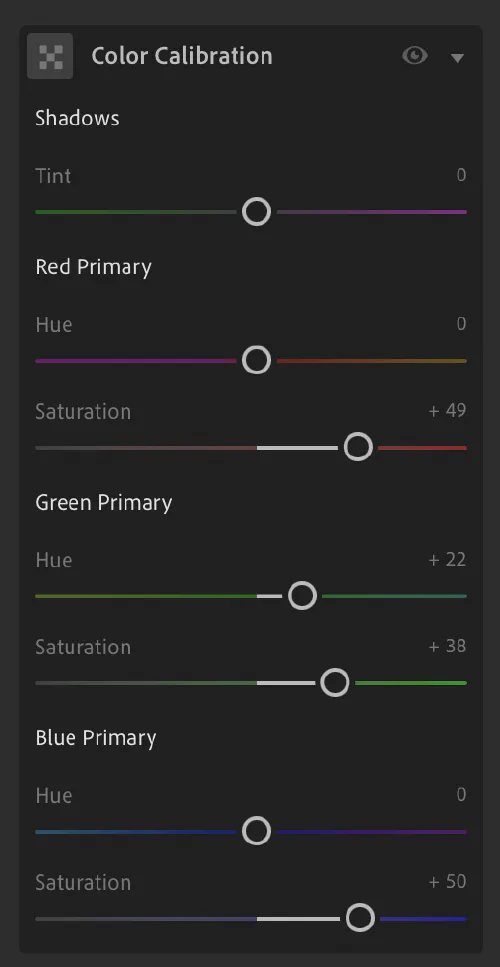
效果上,这等于挪动了色域三角形的三个顶点——也就是改变了"红"“绿"“蓝"这三个字的含义。面板上三组滑块叫 Red Primary / Green Primary / Blue Primary,措辞是刻意的:它们动的是原色,不是画面里的红色物体。
自由度的差别很直观:
| 自由度 | 能固定几个颜色 | |
|---|---|---|
| 白平衡(对角) | 2 | 一个(中性灰) |
| 校准(满矩阵) | 6–8 | 整个色彩空间 |
白平衡像是把地图整体平移,让一个地标对上;满矩阵是旋转加拉伸,让所有地标都对上。
因为它动的是根基,所以拉一点点整张图就大变样。
那为什么不合并成一个矩阵?
数学上完全可以——两个矩阵相乘就是一个矩阵。分开是工作流的需要:
- 白平衡随每张照片变,取决于当时的光源。阴天一个值,室内白炽灯另一个值。
- 相机校准随相机固定,是这台机器的物理特性,配置文件里存一次就够了。
合并了,你就得每张照片重新校准一遍相机。
为什么面板顶上会有一个 Shadows Tint
这是这个面板最令人困惑的地方:如果整个面板都在改原色定义,为什么会突然冒出一个只管暗部的滑块?
答案是:乘法修不了加法造成的误差。
传感器读数在完全没有光的时候也不是零,每个通道都有个微小的固定偏移(黑电平)。假设蓝通道偏移是 3、红是 1,那么在极暗的地方——信号本身只有个位数——这个差值就成了肉眼可见的色偏。
关键在于:这个偏移是常数,不随信号强弱变化。
而白平衡和相机校准都是乘法。乘法只会把偏移一起放大:
那个 永远消不掉,还被放大了。要消掉它,只能用减法:
所以必须有一个加法控件。它出现在 Calibration 面板里,不是因为它和原色定义是一类东西,而是因为两者都属于"修相机自身的毛病”,在管线上处于同一个位置。
为什么只有绿-品红一个方向
这个细节挺妙的。相机传感器用的是 Bayer 阵列,每四个像素里有两个绿、一个红、一个蓝。
绿色是两个采样点平均出来的,红蓝各只有一个。采样数不同,噪声统计特性就不同,在深暗部这个差异被放大,表现出来正好落在绿-品红轴上。
所以 Shadows Tint 只给了这一个方向,不是偷懒,是因为其他方向的偏差本来就不显著。
三种运算,三种误差
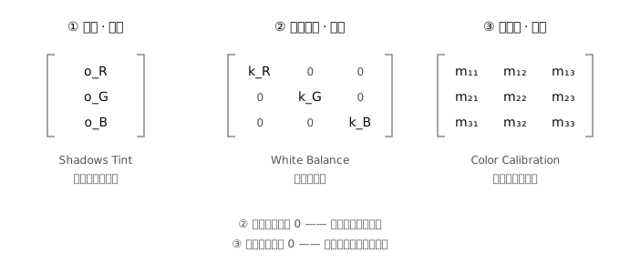
| 运算 | 面板 | 修什么 |
|---|---|---|
| 加法(偏移向量) | Shadows Tint | 传感器黑电平 |
| 对角矩阵(缩放) | White Balance | 光源色偏 |
| 满矩阵(混合) | Color Calibration | 相机色彩性格 |
三种不同的数学,对应三种不同来源的误差,谁也替代不了谁。
这也是为什么它们全挤在管线最上游那一小段——它们做的都是"还原真相"的工作,而不是"表达意图"的工作。
真正的创作,从下一部分才开始。
第四部分 · 调整明暗(管线中游)
8. Light 面板:让三个数字一起变
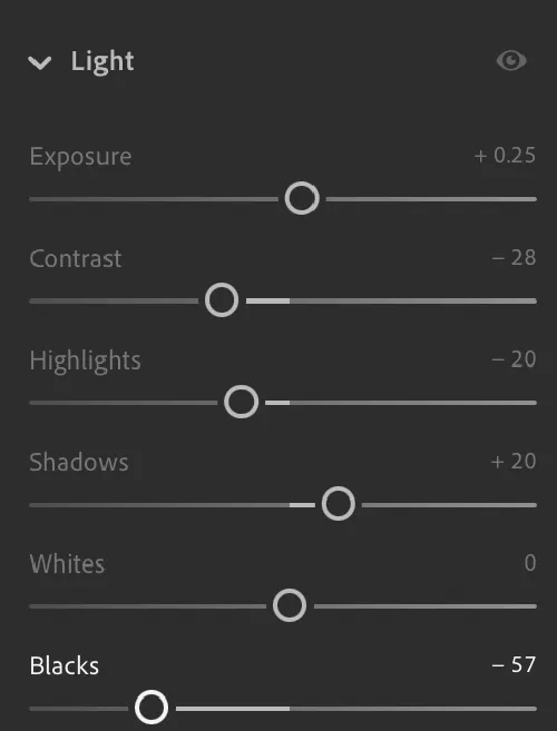
Exposure:最纯粹的一个操作
三个数字同时乘同一个数。乘 2 是亮一档,乘 0.5 是暗一档。
为什么只变亮度、不变颜色?因为比例守恒:
三个数的排序没变、比例没变。按万能钥匙,色相和饱和度都不动,只有平均高度变了。
顺带解释一个细节:曝光的单位是"档”(stop),这是个物理单位,说明它在做线性乘法;而同一面板里其他滑块都是无量纲的 ±100。单位不同,说明底下是两套数学。
Contrast:一个躲不掉的副作用
规则很朴素:本来就亮的变更亮,本来就暗的变更暗。
但这里有个必须知道的连带效果:加对比度会让颜色变艳。
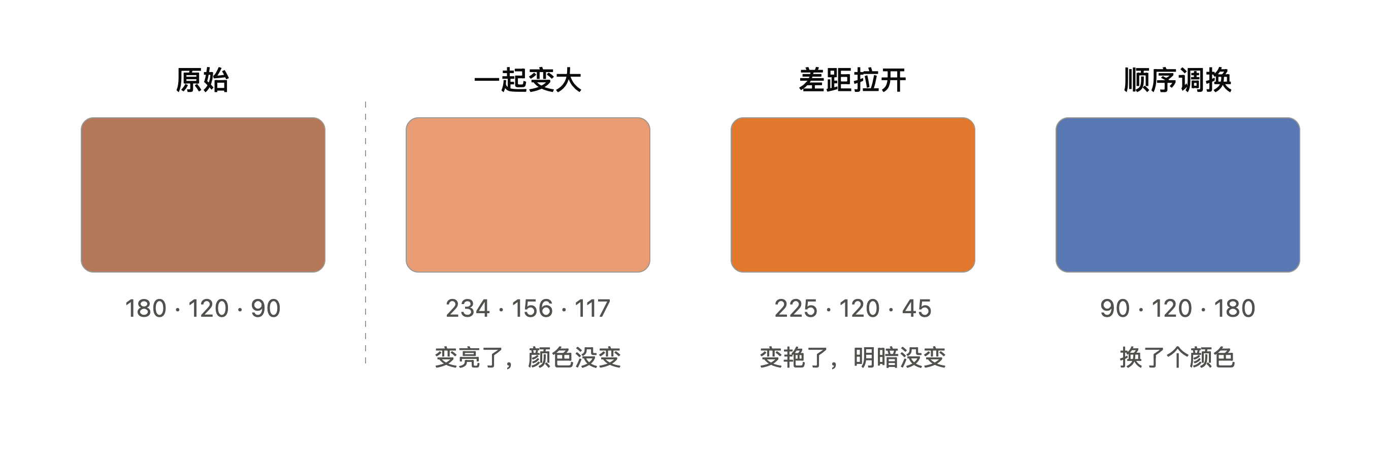
拿一个偏橙的像素 (180, 120, 90) 举例。加对比时,红最大所以被推得更高,蓝最小所以被压得更低:
平均高度差不多,但最大和最小的差距从 90 拉到了 180。按万能钥匙,差距变大就是变艳。
这不是 bug,是数学上躲不掉的。 只要你对三个通道分别做"拉开"的操作,饱和度就一定跟着涨。
而这个副作用,正是第 5 节说的"先明暗后颜色"的原因。
四根分区滑块
Highlights / Shadows / Whites / Blacks 是"只管某个亮度区间"的对比度。
它们需要知道"这个像素属于亮部还是暗部",所以底下几乎肯定有一张模糊后的亮度图当遮罩。这也解释了为什么 Shadows 拉太高会出现光晕——遮罩的边缘过渡不够细。
9. Curve:精细版的明暗控制
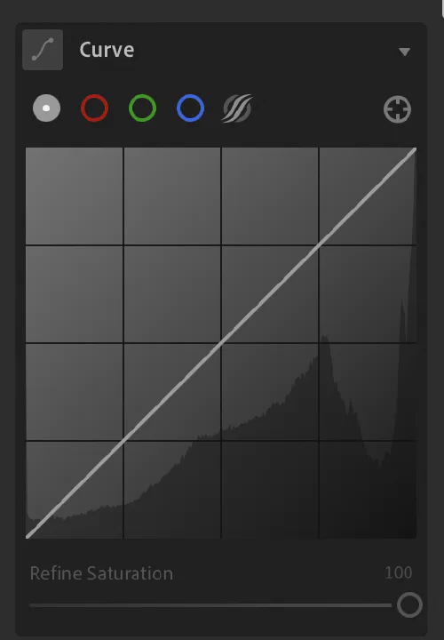
曲线就是一张"输入 → 输出"的对照表。横轴是原来的数字,纵轴是改完的数字。
拉成 S 形,就是把亮的推更亮、暗的压更暗——也就是对比度,只是控制精度高得多。
面板顶上有五个按钮,从左到右是:主曲线 → 红 → 绿 → 蓝 → 参数曲线。最右边那个准星是取样工具。
① 主曲线
它把同一条规则同时套给三个数字。
注意不是"只改亮度"——是 R、G、B 各自按这条曲线查表。所以刚才那个副作用又来了:拉 S 形提对比,颜色会跟着变艳。
面板底下那根 Refine Saturation,就是给这件事擦屁股的。
这根滑块的存在本身就是一条线索。如果 Adobe 是只对亮度做曲线的,这个副作用根本不会发生,也就不需要一根滑块来修它。
一个通用的逆向思路:一个用来修副作用的控件,反证了副作用的成因。 你在任何软件里看到"打补丁型"的选项,都可以反推主逻辑是怎么实现的。
②③④ 三条单通道曲线
这才是真正调色的地方。 只动一个数字,直接改变了三个数的排序和差距——也就是色相和饱和度。
关键是每条曲线都是双向的:往上抬加它自己的颜色,往下压加它的互补色。
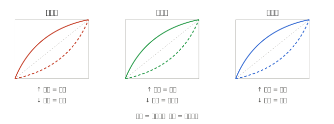
这里有个漂亮的呼应:蓝通道曲线就是 Temp 轴(蓝↔黄),绿通道曲线就是 Tint 轴(绿↔品红)——和白平衡完全一样的两个方向。
那区别在哪?
白平衡是全局的:整张图一起偏。曲线是分区域的:你可以让暗部偏蓝、亮部偏黄,同一张图里两个相反方向同时存在。
这就是"电影感"调色的全部秘密。经典做法:
蓝通道曲线,左端往上抬 + 右端往下压
结果是阴影带青蓝、高光带暖黄。为什么好看?因为这模仿了现实——户外阴影里的光来自蓝天,高光来自暖色的太阳。第七部分会详细说这件事。
⑤ 参数曲线
同样是主曲线,但换了操作方式:不给你自由拖点,改成四根滑块——高光 / 亮调 / 暗调 / 阴影。
| 点曲线 | 参数曲线 | |
|---|---|---|
| 自由度 | 任意造型 | 只能温和起伏 |
| 风险 | 能拉出断层、色偏 | 几乎不会翻车 |
| 适合 | 明确知道要什么 | 快速试探 |
参数曲线在数学上被约束成平滑的,拉到极端也不会出现色带或诡异反转。这是一个用"减少自由度"换"降低风险"的典型设计。
那个准星
取样调整工具。点开后直接在照片上按住某处上下拖动,LR 会自动找到那个亮度在曲线上的位置帮你调。
想压暗天空又不知道天空在曲线的哪一段?点它,在天空上往下拖就行。
三个立刻能用的手法
- 加对比 —— 主曲线拉 S 形。记得看一眼颜色是不是艳过头了。
- 褪色胶片感 —— 主曲线左下角的端点往上提。黑色不再是纯黑,画面像蒙了层灰。
- 冷阴影暖高光 —— 蓝通道左抬右压,幅度要小,一两格就够。
第 2 个特别值得试,因为它用一个动作就说明了曲线的本质:你不是在"加滤镜",你是在改写"输入 0 应该输出多少"这条对照表。
记住这个动作——下一篇讲胶片时,你会发现胶片天生就是这个形状。
第五部分 · 调整颜色(管线下游)
明暗定完了,现在处理颜色。
这一部分的面板,解决的是同一类问题的不同切法:我只想动画面里的一部分颜色,怎么把它们挑出来?
答案有两种切法——按色相切,和按亮度切。
10. Color Mixer:按色相切
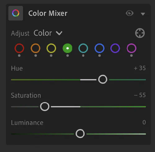
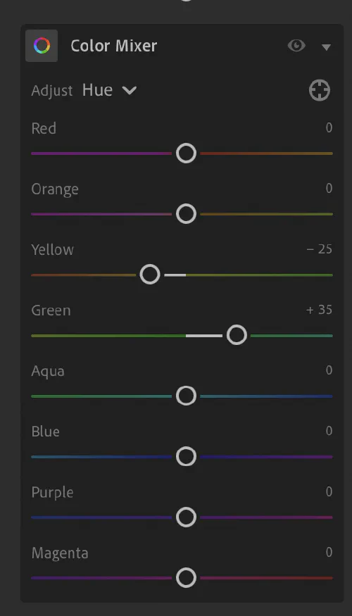
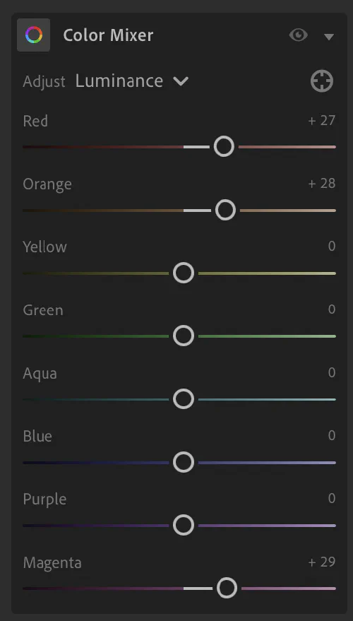
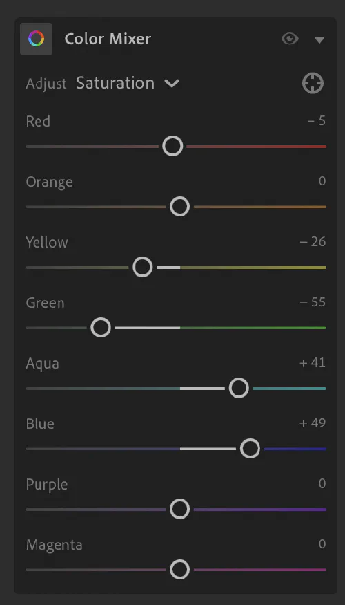
问题
你想让天空更蓝,但不想让人的皮肤跟着变。全局饱和度做不到。
设计
前面的操作都是全图统一。这个面板厉害在它会先看每个像素是什么颜色,再决定要不要动它。
八个色带(红橙黄绿水蓝蓝紫品红),对每一个都能单独调三样东西——正好是万能钥匙的三项:
- Hue = 改排序 → 把绿色的树叶偏向黄一点
- Saturation = 改差距 → 只让天空更蓝
- Luminance = 改高度 → 只把红色压暗
这里的 Luminance 用的是感知亮度,不是三个数的简单平均。人眼对绿最敏感(约 71%),红次之(21%),蓝只有 7%:
这解释了一个实战现象:拉蓝色的 Luminance 对天空杀伤力极大,而拉黄色的 Luminance 感觉温吞。 因为蓝色本来在感知上就很暗(纯蓝的感知亮度只有 7%),稍微一压就深得发沉;而纯黄高达 93%,压下去要费不少力气。
顺带一提,这两个颜色的 HSL 明度都是 50%——可见 HSL 的"明度"和眼睛感受到的亮度完全是两码事。
关键:它看的是色相角,不是"RGB 里有多少红"。
这两件事完全不同。rgb(128, 0, 255) 这个紫色,R 是 128 占了一半,但拖 Red 滑块它纹丝不动——因为色带划分读的是三个数的排序和比例,不是 R 的绝对值。
最能说明问题的是白色:它的 R 是满值 255,却不属于任何色带。三个数相等就没有色相。
为什么八个带的间距不均匀
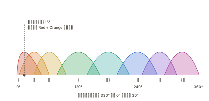
红、橙、黄挤在 0°–60° 这一小段就占了三个带,而 60°–240° 那么宽只有绿、水蓝两个。
这不是数学需要,是产品决策:肤色、夕阳、食物、木头全落在暖色那一小段,值得多给几个精细档位。
图里还有个容易误判的点:色环是首尾相接的。品红在 330°,红在 0°(也就是 360°),它们其实是邻居——所以拖 Red 滑块时,受连带影响最大的是橙和品红,而不是"看起来含红"的紫色。用直线思维会判断错。
怎么判断一个颜色归谁管
最快的办法是用面板右上角那个准星,在照片上按住往上下拖。Lightroom 自己读出色相,自动分配到对应滑块——横跨两个带的话,它会按权重同时动两根。
想心里有数的话,看 R、G、B 谁最大、谁第二:
| 排序 | 色相区间 | 落在哪 |
|---|---|---|
| R > G > B,且 G 接近 B | 0°–20° | 红 |
| R > G > B,G 明显高于 B | 20°–50° | 橙(肤色在这) |
| R ≈ G > B | 50°–70° | 黄 |
| G > R > B | 70°–150° | 绿 |
| G ≈ B > R | 150°–210° | 水蓝 |
| B > G > R | 210°–260° | 蓝 |
| B > R > G | 260°–310° | 紫 |
| R ≈ B > G | 310°–350° | 品红 |
口诀:最大的那个决定大方向,第二大的决定往哪偏。
典型的浅肤色 rgb(230, 180, 150):R 最大 → 红色方向;G(180) 明显高于 B(150) → 往黄偏。落在 20° 左右,橙带为主,红带为辅。
代价:卡在两带之间时,做不到隔离
肤色就是最典型的例子——它不属于任何一个带,而是横跨两个:
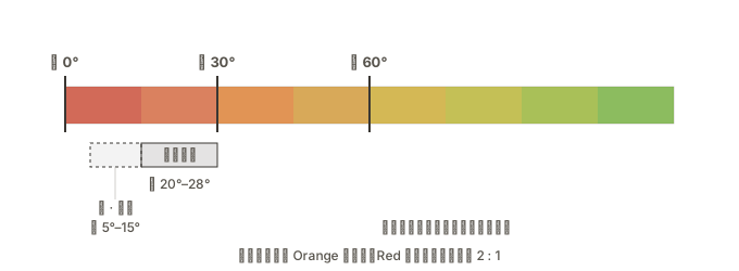
色带之间没有硬边界,是重叠的平滑加权。一个 15° 的颜色,红橙各占一半。
想把它移动 20 个单位,两根滑块都得给 20——但这样纯红(0°)和纯橙(30°)也各自被移动了 20。
Color Mixer 无法只动"中间那段"而不碰两端。 这是加权机制的固有限制,不是操作技巧问题。
实用对策:
- 按距离比例分配。肤色主区在 22° 左右,离橙更近,所以
Orange −15, Red −7这样配,不要两边给一样多。 - 拖之前扫一眼画面,看有没有纯红或纯橙的东西会被误伤。
- 该放弃时就放弃。如果画面里既有人脸又有红衣服,而你只想动脸——用蒙版,别硬试。
判断标准:你要改的是"某种颜色",还是"某个东西"? 前者用 Color Mixer,后者用蒙版。
还有一点:色带按色相分,而低饱和度像素的色相本来就摇摆不定(回想 HSL 圆柱的顶和底)。Lightroom 会按饱和度加权,越接近灰的像素响应越弱。所以你没法用 Color Mixer 给一面灰墙上色。
11. Color Grading:按亮度切
问题
有些需求跟"是什么颜色"无关,只跟"有多亮"有关:我想让所有阴影偏冷、所有高光偏暖,不管它们本来是什么颜色。
设计
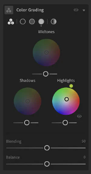
三个色轮,分别管暗部、中间调、亮部。
色轮上转到哪个方向 = 加什么颜色,离圆心多远 = 加多少——这正是第 2 节那个 HSL 圆柱横切下来的一片。
典型用法:暗部加一点蓝,亮部加一点橙。
Balance 和 Blending
这两根滑块管的是三个色轮各自的势力范围:
- Balance = 分界线画在哪
- Blending = 这条线有多模糊
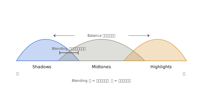
Balance 往右推,亮部的地盘扩大——更多像素被算作"高光",暗部被挤小。
Blending 控制的是重叠宽度,不是距离。 三个区域始终覆盖整个亮度范围,不会因为 Blending 低就分开、中间留出空隙。变的是交界处过渡得多突然:
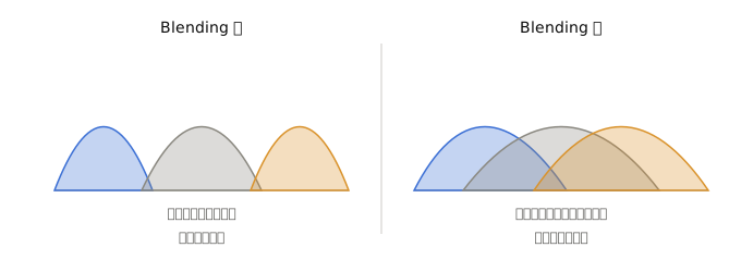
换个比方——想象三盏聚光灯打在墙上:Balance 是把灯往左右挪,Blending 是调焦,决定光斑边缘是刀切一样锐利,还是羽化开来。
| 好处 | 代价 | |
|---|---|---|
| Blending 低 | 暗部的蓝和亮部的橙互不干扰,对比强烈 | 中间调可能出现生硬色带 |
| Blending 高 | 过渡自然 | 两个颜色互相稀释,效果变弱、容易发浑 |
它是滤镜吗?
“在亮部和暗部加有色滤镜"这个理解方向是对的,但两端的运算其实不一样:
| 更像什么 | 数学上 | |
|---|---|---|
| 暗部上色 | 打一盏有色补光灯 | 加法 |
| 亮部上色 | 镜头前加一片滤镜 | 乘法 |
这个区别有实际后果:给暗部上色容易让画面发灰。因为加法直接抬高了黑位——本来是纯黑的地方被加进了蓝光,就不再是纯黑了。这就是"褪色胶片感"的来源,想要就是优点,不想要就是脏。
而亮部是乘法,纯白乘任何颜色还是保持明亮,所以给高光上色更"安全”。
真正的物理滤镜只有乘法一种。所以严格说,Color Grading 比滤镜多了一种能力。
三个面板的分工
这三个面板经常被搞混,其实它们切分画面的依据完全不同:
| 面板 | 按什么切 | 问的问题 |
|---|---|---|
| Color Mixer | 色相 | 这个像素是什么颜色? |
| Color Grading | 亮度 | 这个像素有多亮? |
| Calibration | 不切 | (全局改原色定义) |
打个比方: Color Grading 是分楼层刷漆(一楼刷蓝、三楼刷橙);Calibration 是换了一批不同色号的油漆桶,所有楼层同时受影响。
那谁和 Color Grading 重叠?是曲线的单通道。两者都按亮度上色,区别是:Color Grading 直观、三个固定区域;单通道曲线精度更高,能做"只给 15%–25% 亮度那一段加青"这种细活。
先用 Color Grading 定大方向,再用曲线抠细节,是常见组合。
12. 饱和度 vs 自然饱和度
两个都是"拉开差距",区别在聪明程度。
- Saturation —— 一视同仁,所有像素的差距都拉开同样比例。拉猛了,本来就鲜艳的红花会糊成一片死红。
- Vibrance —— 会先看这个像素本来有多艳:已经很艳的少动,灰扑扑的多动。而且它特意避开肤色范围。
写成式子,Vibrance 比 Saturation 多了两个权重函数:
其中 随饱和度上升而衰减(保护已经很艳的), 在橙色区间凹陷(保护肤色)。
拍人像用 Vibrance 更安全,就是这个原因。
第六部分 · 装饰(管线末端)
13. 局部对比:一类完全不同的操作
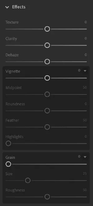
清晰度 / 纹理 / 去朦胧这三个,和前面所有模块有个本质区别:
前面的操作只看当前像素自己,这三个要看周围的像素。
这是运算上的分水岭。前面所有东西都可以写成"输入三个数 → 输出三个数"的函数;而这三个必须知道邻居长什么样,计算量高一个量级。
它们做的都是"局部对比":如果这个点比周围亮,就让它更亮;比周围暗,就让它更暗。区别只在"周围"的范围有多大:
- Texture(纹理) —— 看很小的范围,处理细节,但刻意避开更细的噪点
- Clarity(清晰度) —— 看较大的范围。推太狠会出现边缘光晕,那是范围没控制好的标志
- Dehaze(去朦胧) —— 雾的特点是让所有像素的三个数字都往中间靠拢(差距变小、整体发白),所以去朦胧就是反过来把它们重新推开
14. 晕影与颗粒:模拟物理介质
晕影 = 越靠近画面边缘,三个数字乘的系数越小。用来把视线往中间引。
颗粒 = 给每个像素的数字加一点随机扰动,模拟胶片。
这两个必须放最后,理由在第 5 节说过:它们模拟的是成像时就存在的物理现象。放中间的话,后面的曲线会把晕影再加深一遍,锐化会把颗粒放大成噪点。
顺带记住"颗粒"这一项。下一篇会说明,为什么数码加的颗粒和真实胶片颗粒,是完全不同的两种东西。
到这里整条管线走完了。一句话总结:
先搞清楚数字代表什么颜色(白平衡、校准)→ 调整数字的整体高度(明暗)→ 调整数字之间的差距和排序(颜色)→ 最后加一层装饰(效果)。
几十根滑块,四件事。
第七部分 · 为什么这样调好看
工具讲完了,现在讲更难的那半:什么样的调色是好看的?有没有万能公式?
15. 万能预设为什么会失败
预设是一组固定的参数偏移。同一个偏移作用在不同起点上,结果必然不同——一张欠曝的阴天照和一张顺光的正午照,加同样的 +0.3 曝光、−28 对比,一个救活了一个毁了。
这不是预设做得不够好,是预设这个形式本身的天花板。
但——如果先把所有照片拉到同一个起点呢?
16. 先归一化,再统一
这正是电影行业的标准流程,而且有明确的名字:
| 步骤 | 行业术语 | 做什么 |
|---|---|---|
| ① 归一化 | Primary / Balance | 白平衡、曝光拉到统一基准 |
| ② 局部修正 | Secondary | 蒙版、特定颜色 |
| ③ 统一风格 | Look / LUT | 全片一套,不再逐镜头调 |
第三步之所以能"一套用到底",完全依赖第一步做得干净。 归一化没做好,后面的 look 就会在不同镜头上呈现出不同结果——这正是预设在业余流程里失效的原因。
怎么可靠地归一化?最硬的办法是拍色卡。 现场用同一光线拍一张 ColorChecker,回来生成自定义相机配置文件,套到同场景所有照片上——此时色彩基准在数学上真正对齐了。
没有色卡的话,退而求其次:
- 灰点吸管点画面里本该中性的东西(白墙、灰路面、白衣服的阴影面)
- Lightroom Classic 的 Match Total Exposures 能把一组照片的曝光拉齐
- 肤色当锚点:让脸的色相落在 20°–28°
三个锚点的优先级:中灰 > 肤色 > 白点。 有人的照片以肤色为准,没人的以中灰为准。
17. 人类到底喜欢什么
有答案,而且不神秘——大部分"好看"的调色,都是在模仿自然光的物理规律。
规律一:暖高光 + 冷暗部
这条最深,而且是物理事实,不是审美偏好。
户外有两个光源:太阳是直射光,约 5500K,偏暖;天空是蓝色穹顶,给阴影补光,约 10000K,偏冷。
所以在真实日光下,亮的地方本来就比暗的地方暖。这是我们这个物种睁眼看了几十万年的东西。
顺着它做,画面读起来"自然";反过来做(暖阴影、冷高光),会产生说不清的不安感——恐怖片经常故意这么干。
Color Grading 面板最经典的用法,不是好莱坞发明的风格,是日光的物理结构。
规律二:远处更淡、更冷
大气透视:空气会散射光线,越远的东西饱和度越低、越偏蓝、对比越弱。人脑把这个当作深度线索。
所以主体保饱和、背景压饱和加冷调,画面会立刻有空间感——因为你在给大脑喂它熟悉的信号。
规律三:记忆色不能越界
人对三种颜色有终身校准的内在参照:
| 记忆色 | 大致色相 | 偏离的后果 |
|---|---|---|
| 肤色 | 20°–28° | 偏绿显病态,偏品红显廉价 |
| 天空 | 210°–230° | 偏青显假,偏紫显廉价 |
| 植物 | 90°–120° | 偏黄显枯,偏青显塑料 |
这三个是负向规则——不是"调到这里就好看",而是"偏离了一定难看"。这是唯一真正接近硬规则的一条。
规律四:蓝色确实占便宜
关于颜色偏好,心理学上有个生态效价理论:人对某个颜色的喜好,约等于对"这个颜色的常见事物"的喜好加权平均。
- 蓝 → 晴空、清水 → 跨文化最受欢迎
- 青绿 → 植被、海 → 也很讨喜
- 暗黄绿 / 橄榄 → 腐烂、变质 → 最不受欢迎
所以"多用绿和蓝"这个直觉是有依据的,但要精确一点:受欢迎的是蓝和青绿,不是黄绿。 同样是绿,往蓝偏讨喜,往黄偏就危险。
这解释了为什么调色时把绿色往青蓝推,画面往往立刻变高级。
为什么这些规律有效
心理学里有个概念叫加工流畅性:大脑处理起来越省力的东西,越容易被判断为"美"。
符合自然统计规律的图像,视觉系统处理起来最省力——因为它就是为解析这类图像进化出来的。
还有个漂亮的呼应:自然场景的颜色分布主要沿蓝-黄方向展开(因为日光一天里就是在这个方向变化);而人眼的对立通道正好是蓝-黄;而 Lightroom 的 Temp 轴还是蓝-黄。
光源的变化方向、眼睛的编码方向、软件的控制方向,三者重合。 这不是巧合,是层层适配的结果。
18. 一个可操作的"通用底子"
归一化之后,这套起点相对普适:
Color Grading
  Shadows    ← 加一点青蓝,饱和度极低(5–10)
  Highlights ← 加一点橙黄,饱和度极低(5–10)
  Blending   50,Balance 0

Color Mixer
  Green      色相往青偏(+10 左右),饱和度 −10
  Aqua/Blue  饱和度 +10~15
  Orange     几乎不动(保肤色)

Curve
  轻微 S 形,左下端点抬起 2–5(一点点褪色)
每一条都能对应回上面的规律:
| 操作 | 依据 |
|---|---|
| 冷暗暖亮 | 规律一(日光的物理结构) |
| 绿往青偏、降饱和 | 规律四(躲开黄绿) |
| 蓝青提饱和 | 规律四(往讨喜方向去) |
| 橙不动 | 规律三(保肤色) |
| 端点抬起 | 模仿胶片的趾部 |
这套东西不会让照片惊艳,但会让一组照片看起来是一组。 它的价值在统一,不在出彩。
顺带一句:最强的调色发生在按快门之前
选择拍什么、穿什么、在哪拍,比后期强大得多。
一件荧光粉的外套,后期没有任何办法让它和谐;而一开始就让人穿灰蓝色站在砖墙前,你几乎不用调色。
后期能做的是"强化已有的关系",做不到"无中生有"。
尾声 · 和谐来自约束
最后回到那个"有没有万能公式"的问题。
答案是:有一种东西比公式更有效,但它不是公式,是约束。
对比一下就清楚了:
- 预设失败,是因为它给的是参数——参数遇到不同起点就崩。
- 一卷胶片成功,是因为它给的是约束——36 张照片,晴天阴天、室内室外、人像风景,全部被同一条曲线碾过一遍。
结果是天然的统一性。不是因为那条曲线特别正确,而是因为它对所有照片一视同仁。
数码给了你无限自由,而自由不产生统一。你可以每张照片调得更"对",但一组照片放在一起就是散的。
这也解释了为什么职业摄影师往往只用两三种胶片、或者只用自己那一套 LUT。不是因为找到了最优解,是因为放弃选择本身就是一种风格。
一句实操建议: 别找万能公式,给自己定一套约束。选三种色调,一个固定的对比曲线,一个统一的暗部色偏,然后逼自己所有照片都用它。三个月后你会有风格——不是因为那套参数好,而是因为你坚持了。
下一篇:那么,胶片到底是什么?
这篇文章从头到尾在讲同一件事:数字被规则改变。所有面板都是同一种东西的变奏——输入三个数,输出三个数。
但胶片不是这样工作的。它没有数字,没有查找表,没有矩阵。它是光照在化学物质上,引发一连串反应。
而奇怪的是,很多人觉得胶片的颜色比任何精心调过的数码照片都好看,甚至说那是"自然的给予"。
这个说法恰恰是反的。 胶片色彩是人类历史上最重工程化的色彩系统之一——柯达为了 Portra 的肤色调了几十年配方,Velvia 的高饱和是彻头彻尾的商业决策。它比任何 LUT 都更"人造"。
但它感觉自然。下一篇会拆开这个错觉,具体要回答:
- 为什么胶片的高光不会"死"? —— 数码传感器到了满值就削平,再多的光都记录成同一个数;胶片是化学反应,越接近饱和反应越慢,形成一个渐进的肩部。
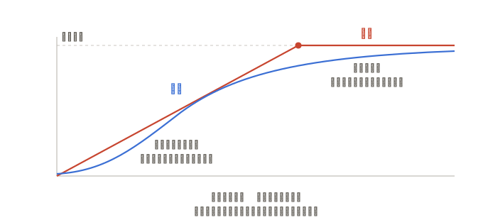
先看这一张。胶片的高光看起来"对",不是因为它准确,而是因为它错得和眼睛一样——那条肩部曲线,恰好和人眼对亮度的压缩响应很像。而这个形状,正是第 9 节那个"端点抬起"手法想模仿的东西。
为什么胶片的颜色是"活"的? —— 数码的三条曲线各自为政;胶片的三层药膜在显影时会互相抑制。这是一个耦合的非线性系统,不是三条独立的查找表能模拟的。
为什么人们爱的,恰恰是工程师当年想消除的? —— 三层特性曲线做不到完全一致,不同密度下平衡会漂移,这个现象叫交叉(crossover),当年被视为缺陷。而残留的那一点交叉,表现出来正是"暗部偏冷、亮部偏暖"——今天所有人都在追的那个"电影感"。
胶片颗粒和数码噪点有什么区别? —— 一个是随机银盐晶体,尺寸随密度变化,是有结构的;一个是逐像素的随机数。
光晕(halation)是怎么来的? —— 强光穿透药膜,从片基背面反射回来,在高光边缘形成红晕。这是 LUT 完全复制不了的。
胶片色彩符合黄金比例吗? —— 不符合。但为什么总有人这么问,这件事本身值得说。
最核心的一点:LUT 是一张静态的 RGB→RGB 映射表,它能相当好地复制胶片的颜色映射,但复制不了捕捉过程。数码高光一旦削平,任何 LUT 都救不回来。
胶片的魔法有一半发生在按快门的那一刻,不在后期。
这就是为什么套了胶片 LUT 的数码照片,常常"像但不是"。像的是映射那一半,缺的是捕捉那一半。
下一篇,我们从银盐晶体开始讲起。
How Colour Works, and What Every Lightroom Slider Is Actually For
Before getting into the Lumen-Neuro project proper, I wanted to lay out the basics of how colour works, and use Lightroom to explain the logic behind colour grading. This article won’t go deep into film — that’s coming in a later post. Author: Weiyi | Repo:
github.com/Waye/Lumen-Neuro| Status: M2 complete (2026-06-02, commit dd3cba1), arXiv preprint package ready
Prologue: An Odd Question to Start With
Open Lightroom and you’re faced with dozens of sliders. Most tutorials will tell you “drag this one right and the image gets brighter.” You do, and it does.
But hardly anyone asks: why these particular sliders?
Why does white balance have two rather than three? Why is there a slider called “Refine Saturation” tucked under the curve panel? Why does a shadows-only control suddenly appear inside Camera Calibration? And why does every tutorial insist you fix exposure before colour — is that just convention, or is there a reason?
What this article argues is that none of these sliders is arbitrary. Each one solves a specific problem. And trace those problems far enough upstream and they all lead to the same place: the human eye.
Once you see that chain, you don’t need to memorise a single parameter.
Part One · What Colour Actually Is
1. “Three” Is a Fact About Eyes, Not About Light
Let’s clear up the most common misconception first.
Sunlight contains infinitely many wavelengths. The spectrum is continuous — there’s no break anywhere between red and violet. So the statement “there are three basic colours” is, physically speaking, wrong.
So where does three come from?
From the eye. The human retina has only three types of cone cell, sensitive to short, medium and long wavelengths. Any light entering the eye, however complex, gets compressed down to three signal values from those three cells.
That compression is irreversible. Two beams of completely different spectral composition will look identical to you as long as the three values match — this is called metamerism, and it’s the reason every display technology works at all.
A screen fools you with just three lamps because it only has to match three numbers.
Two counterintuitive things live in that chart. First, the so-called “red” cone (L) peaks at 564nm, which is actually yellow-green — nowhere near red. Second, the M and L curves overlap heavily: your ability to distinguish red from green comes from the difference between those two curves, not from independent responses.
Put differently, the names “red, green, blue” are approximate labels attached after the fact.
Light Adds
Every pixel on a screen is three small lamps. The stage starts black, because black is simply the absence of light. Every step up injects more light into the picture.
Additive sliders = intensity of light
All three at full, every wavelength present: white.
Pigment Subtracts
Pigment works in reverse. White paper reflects every wavelength back, so the stage starts white. Every layer of pigment removes a band of wavelengths:
| Pigment | Absorbs | i.e. switches off which channel |
|---|---|---|
| Cyan | Red light | R |
| Magenta | Green light | G |
| Yellow | Blue light | B |
Subtractive sliders = concentration of pigment
All three at full, all three bands absorbed: near black.
“Near” because real inks can’t absorb perfectly — CMY at full strength gives a muddy dark brown. That’s precisely why printing adds a separate black plate, giving us the K in CMYK.
Your art teacher’s “blue plus yellow makes green” and your physics teacher’s “blue light plus yellow light makes white” are both correct. They describe two fundamentally different operations. People argued about this contradiction for over a century.
2. One Colour, Two Addresses
RGB isn’t the only way to describe a colour.
RGB is like Cartesian coordinates — three edges locate a point. HSL bends that same space into a cylinder: hue is the angle around the axis, saturation is the distance from the centre axis, lightness is the height.
Try dragging this one:
Drag any slider on the left and the right side follows, and vice versa. Both sets of numbers always point at the same swatch — these aren’t two colours, they’re two ways of writing one colour.
Why have two coordinate systems? Because some operations are trivial in one and nearly impossible in the other.
Rotating a colour’s “direction” is one slider in HSL; in RGB you’d have to compute three numbers simultaneously with no intuitive relationship between them. Conversely, brightening the whole image is a single multiplication across three RGB numbers, and awkward in HSL.
Neither system is better. Different Lightroom panels pick different coordinates — and which one they pick depends on what problem that panel is trying to solve.
Try dragging saturation to 0: the point slides onto the centre axis, the grey line running from black to white. Now drag lightness to 0 or 100 and the entire colour ring collapses to black or white. At the top and bottom of the cylinder, every combination of hue and saturation points at the same colour — all those coordinates are wasted. This is HSL’s biggest structural flaw, and it comes back later.
3. A History Where Every Step Was Half Right
It took humanity three hundred years to arrive at “three is a fact about eyes,” and every step along the way got something wrong.
| Year | What was discovered | What was wrong at the same time |
|---|---|---|
| 1666 Newton | White light is composite; colour isn’t in the light, it’s a sensation | Forced it into seven colours to match musical notes; considered every wavelength equally fundamental, never arrived at “three” |
| 1720s Le Blon | Three-colour printing works; noticed pigment and light run in opposite directions | Chose red-yellow-blue; couldn’t explain why, leaving the contradiction unresolved for a century |
| 1801 Young | The retina can’t have a receptor per wavelength, so there must be only a few channels — reasoned it was three | Pure inference, zero evidence; guessed red-yellow-blue, then revised to red-green-violet, both wrong |
| 1850s Helmholtz | Additive and subtractive mixing formally separated: pigment subtracts, light adds | Trichromatic theory couldn’t explain afterimages, or why there’s no “reddish green” |
| 1860s Hering | Added opponent-process theory: red-green and blue-yellow as antagonistic pairs | Considered mutually exclusive with trichromacy for decades; only later understood as two successive stages of vision |
| 1861 Maxwell | Colour became measurable; produced the first colour photograph | Emulsions of the era were nearly blind to red, so the red plate shouldn’t have registered at all — only in 1961 was it traced to ultraviolet |
| 1868 Ducos du Hauron | Proposed CMY, each removing one RGB channel | Printing stuck with red-yellow-blue for decades more, needlessly narrowing its gamut |
| 1964 | Microspectrophotometry finally measured the three cone types directly | 163 years after Young reasoned it out |
The biggest error was actually the same one throughout: from Newton to Le Blon, everyone was asking “what’s in the light?” In 1801 Thomas Young reframed it as “what can the eye distinguish?” — and the answer surfaced.
His reasoning is elegant and involved no experiment at all: the spectrum has infinitely many wavelengths, and the retina cannot physically host a cell type for each. Yet three lights suffice to reproduce nearly every colour — so the receiving end must have very few channels. He guessed three.
The microscope confirmed him a hundred and sixty-three years later.
As for why red, green and blue specifically — the eye fixes the number of channels; which three lights to use is pure engineering. Pick three wavelengths far enough apart to stretch the gamut triangle as wide as possible. Dogs have two cone types, many birds have four; their answers are entirely different from ours.
Part Two · A Photograph Is Just a Pile of Three-Number Groups
4. The Master Key
Every pixel on screen is, in the end, three numbers: how much red, how much green, how much blue, each from 0 to 255.
(255, 0, 0) is pure red, (0, 0, 0) is black, (255, 255, 255) is white. A 24-megapixel photograph is 24 million such triplets.
So editing a photo comes down to exactly one thing: changing those three numbers according to some rule.
And every possible rule reduces to three basic moves:
| The three numbers’ … | determines | corresponds to in HSL |
|---|---|---|
| average height | brightness | L, lightness |
| gap between largest and smallest | vividness | S, saturation |
| which is largest, which is smallest | what colour it is | H, hue |
These aren’t metaphors — they can be written down. Let be the largest of the three and the smallest:
Lightness is the midpoint between largest and smallest; saturation is proportional to the gap between them, divided by the total so that brightness doesn’t affect it.
When the gap is 0 the numerator is 0, so saturation is 0 — that’s grey. Which is why grey “has no colour”: all three channels are equal, there’s no way to tell which dominates, and the question “what colour is it” has no answer at all.
Keep this key in mind. For every panel below, you only need to ask: which of the three is it changing?
5. The Pipeline: Why the Order Cannot Change
Before dismantling the panels, one more thing — the order panels appear in the interface is not the order they execute in.
Lightroom is non-destructive: every slider you touch just adds a line to an instruction sheet, and the original file is never altered. At render time, it runs this fixed pipeline:
Why must it be this order? Three reasons, each more important than the last.
① Calibrate before you touch anything. White balance and camera calibration establish what these numbers actually represent. It’s like calibrating an instrument before an experiment — get the standard wrong and every measurement afterwards is wrong.
② Tone before colour. This one is a hard constraint, and it has a mathematical basis.
We’ll prove below that changing brightness incidentally changes saturation (because the three numbers get pulled apart). So the order can only be:
Fix the tonality first → colour has now been altered as a side effect → then adjust colour to what you actually want
Do it the other way round — carefully tune colour, then touch exposure and contrast — and your careful work gets undone.
Every tutorial says “exposure before colour.” That isn’t convention, it’s a mathematical dependency.
③ Finishing goes last. Vignetting simulates lens falloff, grain simulates film texture; both belong to “physical phenomena present at capture.” Put them mid-pipeline and later curves would deepen the vignette a second time, and sharpening would amplify the grain into noise.
What follows walks the pipeline in order.
Part Three · Recovering the Truth (Upstream)
The tools at the top of the pipeline share something: none of them is creative. They’re all corrective.
There are three sources of error to correct — the light was wrong, the camera is imprecise, the sensor has a flaw. And each demands a different kind of arithmetic.
6. White Balance: Calibrating the Ruler First
The problem
The three numbers a camera records depend heavily on the light at the time. The same sheet of white paper photographed under evening lamplight gives elevated red; under overcast sky, elevated blue.
If the ruler itself is crooked, nothing you measure with it is right.
The design
White balance does something simple: multiply each of the three numbers by a coefficient, so that things which should be white return to neutral.
Written as a matrix it’s clearer:
Note that everything off the diagonal is 0. This form is called a diagonal matrix, and it means: red affects only red, green only green, no crosstalk whatsoever between channels. Hold onto that — the next section uses it immediately.
The goal is that a neutral grey object satisfies after imaging.
Why only two sliders
There are clearly three unknowns , so why does the interface offer only two sliders?
Because there’s a constraint: scaling overall brightness doesn’t affect colour.
Suppose you multiply all three gains by a constant :
The ratios between the three numbers are unchanged — they’ve simply all grown. The image gets brighter or darker, but whether it has a colour cast hasn’t shifted at all. And overall brightness is already the exposure slider’s job.
So one of the three gains is redundant:
Mathematically: in a three-dimensional vector space, if you only care about direction and not length, you have two degrees of freedom.
Incidentally, Photoshop’s Color Balance offers three sliders (cyan-red, magenta-green, yellow-blue). It looks more complete but it’s redundant — push all three to the maximum and the colour returns to where it started, only brighter or darker. Only two of the three are independent. Lightroom’s two sliders are the more honest design.
Why blue-yellow and green-magenta
Any two non-parallel directions would work mathematically. Why these two?
Because that’s how light in the real world is actually distributed.
Essentially all the light humans use comes from heating something up. The colour of a heated object’s glow depends only on its temperature: red → orange → yellow → white → blue-white. Candle 1800K, incandescent 2700K, daylight 5500K, overcast 7000K, blue sky 10000K — every one of them sits on that single line.
That’s the Temp axis. It maps to a genuine physical quantity, which is why its unit is kelvin.
But some light isn’t produced by heat. Fluorescent tubes and some LEDs work by gas discharge, giving spiky spectra that skew noticeably green; so does light underwater or under dense foliage. These sources sit off the temperature axis, and the direction they deviate in is precisely green-magenta.
That’s the Tint axis. It has no physical unit because it only expresses “how far off.”
| Slider | What it does at the channel level |
|---|---|
| Temp blue↔yellow | Pulls B against R+G |
| Tint green↔magenta | Pulls G against R+B |
Why does yellow correspond to “R+G”? Because yellow light is red plus green — recall the additive demo, where the overlap of the red and green circles is exactly yellow. So “add yellow” and “subtract blue” are the same operation. Likewise magenta is red plus blue, so “add magenta” equals “subtract green.”
Any neutral light source’s cast decomposes onto these two axes:
- Orange cast = towards yellow + a little magenta
- Cyan cast = towards blue + a little green
- Purple cast = towards blue + a little magenta There is no colour cast that Temp and Tint together cannot reproduce.
A coincidence that isn’t one
Modern colour science’s most-used space, Lab, has two colour axes: green↔red-magenta and blue↔yellow — identical to Tint and Temp.
And Lab is defined that way because it follows the eye’s opponent-process mechanism: the three cone signals get re-encoded into “light-dark,” “red-green” and “blue-yellow” before reaching the brain.
Which also explains an everyday oddity: you can picture a yellowish green but not a yellowish blue — they sit at opposite ends of the same axis, mutually exclusive.
So these two axes satisfy three things at once: they span the colour plane mathematically, they align with how real light sources are distributed, and they align with how the eye encodes colour.
Any other pair of directions would be mathematically valid, but none satisfies the latter two.
The cost
With two degrees of freedom, white balance can do exactly one thing: make one colour neutral.
Getting the grey card right doesn’t mean any other colour is right. That limitation is what necessitates the next panel.
7. Color Calibration: Redefining What “Red” Means
The problem
Two cameras both render white paper as standard white, but photograph the same red rose and camera A leans orange while camera B leans magenta.
White balance can never fix that difference.
Why? Because fixing it requires letting “a little blue mix into the red output” — and that position in the diagonal matrix is 0.
The design
Fill the matrix in:
Non-zero off-diagonal elements mean channels start mixing: the red output now contains contributions from green and blue input.
In effect this shifts the three vertices of the gamut triangle — that is, it changes what the words “red,” “green” and “blue” mean. The panel’s three slider groups are called Red Primary, Green Primary and Blue Primary, and the wording is deliberate: they move the primaries, not the red objects in your picture.
The difference in degrees of freedom is stark:
| Degrees of freedom | Colours it can pin down | |
|---|---|---|
| White balance (diagonal) | 2 | one (neutral grey) |
| Calibration (full matrix) | 6–8 | the whole colour space |
White balance is like sliding a map sideways to line up one landmark; the full matrix rotates and stretches it so all the landmarks line up.
Because it moves the foundation, a small nudge transforms the entire image.
So why not merge them into one matrix?
Mathematically you could — two matrices multiplied together are one matrix. They’re kept apart for workflow reasons:
- White balance changes per photograph, depending on the light at the time. One value overcast, another under tungsten indoors.
- Camera calibration is fixed per camera, a physical property of that machine, stored once in a profile. Merge them and you’d have to recalibrate the camera for every single photo.
Why is there a Shadows Tint at the top
This is the panel’s most confusing feature: if the whole panel redefines primaries, why does a shadows-only slider suddenly appear?
Because multiplication cannot fix an error caused by addition.
Sensor readings aren’t zero even in total darkness — each channel carries a small fixed offset (the black level). Say the blue channel’s offset is 3 and red’s is 1: in very dark areas, where the signal itself is in single digits, that difference becomes a visible cast.
The crucial point: that offset is a constant. It doesn’t scale with signal strength.
And both white balance and calibration are multiplications. Multiplication just scales the offset along with everything else:
That never goes away — it’s been amplified. Removing it requires subtraction:
So an additive control is mandatory. It lives in the Calibration panel not because it’s conceptually related to primaries, but because both belong to “fixing the camera’s own defects,” and sit at the same point in the pipeline.
Why only the green-magenta direction
This detail is rather neat. Camera sensors use a Bayer array, where every group of four pixels contains two green, one red and one blue.
Green is averaged from two samples, red and blue from one each. Different sample counts mean different noise statistics, and in deep shadow that difference gets amplified — landing precisely on the green-magenta axis.
So Shadows Tint offering only that one direction isn’t laziness; deviations in other directions simply aren’t significant.
Three operations, three kinds of error
| Operation | Panel | Fixes |
|---|---|---|
| Addition (offset vector) | Shadows Tint | sensor black level |
| Diagonal matrix (scaling) | White Balance | light source cast |
| Full matrix (mixing) | Color Calibration | camera colour character |
Three different pieces of mathematics, three different sources of error, none substitutable for another.
Which is why they’re all crammed into that short stretch at the top of the pipeline — they’re all doing the work of “recovering the truth,” not “expressing intent.”
Actual creative work starts in the next section.
Part Four · Adjusting Tone (Midstream)
8. The Light Panel: Moving All Three Numbers Together
Exposure: the purest operation there is
All three numbers multiplied by the same value. Times 2 is one stop brighter, times 0.5 one stop darker.
Why does this change brightness but not colour? Because the ratios are preserved:
The order is unchanged and the ratios are unchanged. By the master key, hue and saturation both stay put and only the average height moves.
One detail worth noting: exposure is measured in stops, a physical unit, which tells you it’s doing linear multiplication; every other slider in the same panel is a dimensionless ±100. Different units mean different mathematics underneath.
Contrast: an unavoidable side effect
The rule is plain enough: what’s bright gets brighter, what’s dark gets darker.
But there’s a consequence you have to know about: adding contrast makes colours more vivid.
Take that orange-leaning pixel (180, 120, 90). Adding contrast pushes red — the largest — higher, and blue — the smallest — lower:
The average height is roughly the same, but the gap between largest and smallest went from 90 to 180. By the master key, a wider gap means more saturation.
This isn’t a bug, it’s mathematically unavoidable. Any operation that “spreads out” the three channels separately will increase saturation.
And that side effect is exactly why section 5 insists on tone before colour.
The four regional sliders
Highlights, Shadows, Whites and Blacks are contrast confined to particular brightness ranges.
They need to know whether a given pixel belongs to the highlights or the shadows, so there’s almost certainly a blurred luminance map acting as a mask underneath. Which also explains why pushing Shadows too far produces halos — the mask’s edge transition isn’t fine enough.
9. Curves: The Precise Version of Tone Control
A curve is a lookup table mapping input to output. The horizontal axis is the original number, the vertical axis the number after adjustment.
Bend it into an S and you push bright values brighter and dark values darker — contrast again, but with far more control.
There are five buttons at the top, left to right: master curve → red → green → blue → parametric curve. The crosshair at the far right is the targeted adjustment tool.
① The master curve
It applies the same rule to all three numbers at once.
Note that this is not “brightness only” — R, G and B each get looked up through that curve. So the side effect returns: pull an S-curve for contrast and colours get more vivid.
That Refine Saturation slider at the bottom of the panel exists to clean up after exactly this.
The slider’s existence is itself a clue. If Adobe were applying the curve to luminance alone, the side effect wouldn’t occur, and no slider would be needed to correct it.
A general reverse-engineering heuristic: a control that exists to patch a side effect is evidence for how the main logic is implemented. Any time you spot a “patch-type” option in software, you can work backwards to the underlying mechanism.
②③④ The three single-channel curves
This is where colour grading actually happens. Move one number only, and you’ve directly changed the order and the gap between the three — hue and saturation.
The key is that each curve is bidirectional: raise it to add its own colour, lower it to add the complement.
There’s a satisfying echo here: the blue channel curve is the Temp axis (blue↔yellow), and the green channel curve is the Tint axis (green↔magenta) — the very same two directions as white balance.
So what’s the difference?
White balance is global: the whole image shifts together. Curves are regional: you can make shadows lean blue and highlights lean yellow, two opposite directions coexisting in one image.
That’s the entire secret of “cinematic” grading. The classic move:
On the blue channel curve, lift the left end and lower the right end
The result is cyan-blue shadows and warm yellow highlights. Why does it look good? Because it imitates reality — outdoors, shadow light comes from the blue sky and highlights from the warm sun. Part Seven covers this properly.
⑤ The parametric curve
Same master curve, different interface: instead of dragging points freely, you get four sliders — Highlights, Lights, Darks, Shadows.
| Point curve | Parametric curve | |
|---|---|---|
| Freedom | any shape | gentle undulation only |
| Risk | can produce banding and casts | almost impossible to break |
| Best for | knowing exactly what you want | quick exploration |
The parametric curve is mathematically constrained to stay smooth, so even at extremes you won’t get banding or bizarre reversals. It’s a textbook case of trading degrees of freedom for safety.
That crosshair
The targeted adjustment tool. Activate it, then click and drag directly on the photograph, and Lightroom finds the corresponding position on the curve for you.
Want to darken the sky but don’t know where the sky sits on the curve? Click it, drag down on the sky.
Three techniques you can use immediately
- Add contrast — S-curve on the master. Check afterwards whether the colours have gone too vivid.
- Faded film look — lift the bottom-left endpoint of the master curve. Black is no longer pure black and the image looks veiled.
- Cool shadows, warm highlights — blue channel lifted at the left, lowered at the right. Keep it subtle, a notch or two is plenty. The second is especially worth trying, because a single action demonstrates what a curve fundamentally is: you aren’t “applying a filter,” you’re rewriting the entry that says what input 0 should output.
Remember that move — when we get to film in the next article, you’ll find film is born with this shape.
Part Five · Adjusting Colour (Downstream)
Tone is settled; now for colour.
The panels in this section solve one class of problem in different ways: I only want to change part of the colours in this image — how do I isolate them?
There are two ways to slice: by hue, and by brightness.
10. Color Mixer: Slicing by Hue
The problem
You want a bluer sky without the skin tones following along. Global saturation can’t do that.
The design
Every operation so far applied uniformly. What makes this panel powerful is that it looks at each pixel’s colour first, then decides whether to touch it.
Eight hue bands (red, orange, yellow, green, aqua, blue, purple, magenta), each adjustable in three ways — precisely the three items of the master key:
- Hue = change the order → nudge green foliage towards yellow
- Saturation = change the gap → deepen only the sky
- Luminance = change the height → darken only the reds The Luminance here is perceptual brightness, not a simple average of the three numbers. The eye is most sensitive to green (about 71%), then red (21%), and blue only 7%:
This explains something practical: dragging blue Luminance devastates a sky, while dragging yellow Luminance feels sluggish. Pure blue’s perceptual brightness is only 7%, so a small push sends it very dark; pure yellow sits at 93% and takes real effort to move.
Incidentally, both of those colours have an HSL lightness of 50% — which shows how completely HSL’s “lightness” differs from what the eye perceives as brightness.
The crucial point: the panel reads hue angle, not “how much red is in the RGB.”
These are entirely different things. That purple, rgb(128, 0, 255), has R at 128 — half the total — yet dragging the Red slider does nothing to it, because band assignment reads the order and ratios of the three numbers, not R’s absolute value.
White makes the point best: its R is a full 255, yet it belongs to no band at all. Three equal numbers means no hue.
Why the eight bands are unevenly spaced
Red, orange and yellow are crammed into the 0°–60° stretch and take three bands between them, while the much wider 60°–240° range gets only green and aqua.
That isn’t a mathematical requirement, it’s a product decision: skin, sunsets, food and wood all fall in that narrow warm segment, so it earns more resolution.
The chart shows one more easily misjudged thing: the hue circle wraps around. Magenta at 330° and red at 0° (i.e. 360°) are neighbours — so when you drag the Red slider, what gets caught in the crossfire is orange and magenta, not the purple that “looks like it contains red.” Linear thinking leads you astray here.
How to tell which band a colour belongs to
The quickest method is the crosshair at the panel’s top right: click and drag on the photograph. Lightroom reads the hue itself and distributes the adjustment to the right sliders — moving both, weighted, if the colour straddles two bands.
If you want to reason it out, look at which of R, G and B is largest and which is second:
| Order | Hue range | Which band |
|---|---|---|
| R > G > B, with G close to B | 0°–20° | red |
| R > G > B, G clearly above B | 20°–50° | orange (skin lives here) |
| R ≈ G > B | 50°–70° | yellow |
| G > R > B | 70°–150° | green |
| G ≈ B > R | 150°–210° | aqua |
| B > G > R | 210°–260° | blue |
| B > R > G | 260°–310° | purple |
| R ≈ B > G | 310°–350° | magenta |
The rule of thumb: the largest sets the general direction, the second-largest sets which way it leans.
A typical light skin tone, rgb(230, 180, 150): R largest, so the red direction; G (180) clearly above B (150), so leaning towards yellow. That lands around 20° — primarily the orange band, with red as support.
The cost: colours between bands can’t be isolated
Skin is the classic example — it belongs to no single band and straddles two:
There are no hard boundaries between bands, just smooth overlapping weights. A colour at 15° is half red and half orange.
To move it by 20 units, both sliders have to go to 20 — but that also moves pure red (0°) and pure orange (30°) by 20 each.
Color Mixer cannot touch “the middle” without touching both ends. That’s an inherent limitation of the weighting mechanism, not a matter of technique.
Practical responses:
- Split proportionally by distance. Skin’s main region sits around 22°, closer to orange, so something like
Orange −15, Red −7. Don’t give both sides the same amount. - Scan the frame first for pure reds or pure oranges that would get hit.
- Know when to give up. If the frame contains both a face and a red garment and you only want the face — use a mask, don’t force it.
The test: are you changing “a colour” or “a thing”? The former is Color Mixer, the latter is masking.
One more thing: bands are defined by hue, and the hue of low-saturation pixels is inherently unstable (recall the top and bottom of the HSL cylinder). Lightroom weights by saturation, so the closer to grey a pixel is, the weaker its response. Which is why you can’t use Color Mixer to tint a grey wall.
11. Color Grading: Slicing by Brightness
The problem
Some needs have nothing to do with “what colour” and everything to do with “how bright”: I want all the shadows cooler and all the highlights warmer, regardless of their original colour.
The design
Three colour wheels, for shadows, midtones and highlights.
The direction you rotate towards is which colour to add, the distance from the centre is how much — which is exactly one horizontal slice through the cylinder from section 2.
Typical usage: a touch of blue in the shadows, a touch of orange in the highlights.
Balance and Blending
These two sliders control each wheel’s territory:
- Balance = where the boundary is drawn
- Blending = how blurred that boundary is
Push Balance right and the highlights’ territory expands — more pixels count as “highlight,” squeezing the shadows.
Blending controls overlap width, not distance. The three regions always cover the entire brightness range; a low Blending doesn’t separate them and leave a gap in between. What changes is how abrupt the transition is at the boundaries:
Another way to picture it — imagine three spotlights on a wall: Balance moves the lamps left and right, Blending adjusts the focus, deciding whether the edges of the pools are knife-sharp or feathered.
| Benefit | Cost | |
|---|---|---|
| Low blending | shadow blue and highlight orange stay clean, strong contrast | midtones may show a hard band |
| High blending | natural transitions | the two colours dilute each other, weaker and muddier |
Is it a filter?
Reading it as “adding a coloured filter to highlights and shadows” points the right way, but the arithmetic at the two ends is actually different:
| More like | Mathematically | |
|---|---|---|
| Tinting shadows | shining a coloured fill light | addition |
| Tinting highlights | putting a filter in front of the lens | multiplication |
This difference has a practical consequence: tinting shadows tends to grey the image out. Addition raises the black point directly — what was pure black now has blue light added and isn’t pure black any more. That’s the origin of the “faded film” look: a virtue if you want it, dirt if you don’t.
Highlights are multiplicative, and pure white times any colour stays bright, so tinting highlights is safer.
A real physical filter can only multiply. So strictly speaking, Color Grading has one capability that filters don’t.
How the three panels divide the work
These three get confused constantly, but they slice the image on completely different criteria:
| Panel | Slices by | The question it asks |
|---|---|---|
| Color Mixer | hue | what colour is this pixel? |
| Color Grading | brightness | how bright is this pixel? |
| Calibration | doesn’t slice | (redefines primaries globally) |
An analogy: Color Grading paints by floor (blue on the first, orange on the third); Calibration swaps in a different batch of paint, affecting every floor at once.
So what overlaps with Color Grading? The single-channel curves. Both tint by brightness. The difference: Color Grading is intuitive with three fixed regions; single-channel curves are more precise and can do “add cyan to only the 15%–25% brightness range.”
Using Color Grading for the broad direction and curves for detail is a common pairing.
12. Saturation vs Vibrance
Both “widen the gap”; the difference is how smart they are.
- Saturation — treats everything alike, widening every pixel’s gap by the same proportion. Push it hard and already-vivid red flowers smear into a dead block of colour.
- Vibrance — checks how vivid the pixel already is: barely touches the vivid ones, works hardest on the drab ones. And it deliberately avoids the skin tone range. As an expression, Vibrance has two weighting functions that Saturation lacks:
where decays as saturation rises (protecting what’s already vivid) and dips in the orange range (protecting skin).
Which is why Vibrance is the safer choice for portraits.
Part Six · Finishing (End of the Pipeline)
13. Local Contrast: A Different Class of Operation
Clarity, Texture and Dehaze differ from every module above in one fundamental way:
Everything before this looks only at the current pixel. These three have to look at the neighbours.
That’s a computational watershed. Everything above can be written as “three numbers in, three numbers out”; these three need to know what the surroundings look like, an order of magnitude more work.
All three do “local contrast”: if this point is brighter than its surroundings, make it brighter still; darker, make it darker. The only difference is how large “surroundings” means:
- Texture — a very small radius, working on fine detail while deliberately avoiding still-finer noise
- Clarity — a larger radius. Push it too hard and you get edge halos, the signature of a radius out of control
- Dehaze — haze pulls all three numbers of every pixel towards the middle (smaller gaps, overall whitening), so dehazing simply pushes them back apart
14. Vignette and Grain: Simulating a Physical Medium
Vignette = the closer to the frame edge, the smaller the coefficient the three numbers are multiplied by. It pulls the eye towards the centre.
Grain = a small random perturbation added to each pixel’s numbers, imitating film.
Both must go last, for the reason given in section 5: they simulate physical phenomena present at the moment of capture. Mid-pipeline, later curves would deepen the vignette a second time and sharpening would blow the grain up into noise.
Keep “grain” in mind. The next article explains why digitally added grain and real film grain are entirely different things.
That’s the whole pipeline. In one sentence:
Work out what the numbers represent (white balance, calibration) → adjust their overall height (tone) → adjust the gaps and order between them (colour) → add a layer of finishing on top (effects).
Dozens of sliders, four jobs.
Part Seven · Why This Looks Good
The tools are covered. Now the harder half: what makes a grade good? Is there a universal formula?
15. Why Universal Presets Fail
A preset is a fixed set of parameter offsets. The same offset applied to different starting points must give different results — an underexposed overcast shot and a front-lit noon shot, both given +0.3 exposure, −28 contrast, and one is rescued while the other is ruined.
That’s not a preset being badly made; it’s the ceiling of the preset as a format.
But — what if you first pull every photo to the same starting point?
16. Normalise First, Then Unify
This is exactly the film industry’s standard workflow, and it has proper names:
| Step | Industry term | What it does |
|---|---|---|
| ① Normalise | Primary / Balance | pull white balance and exposure to a common baseline |
| ② Local correction | Secondary | masks, specific colours |
| ③ Unified style | Look / LUT | one for the whole film, no per-shot grading |
Step three can be “one look throughout” only because step one was done cleanly. Skip the normalisation and the look renders differently on every shot — which is precisely why presets fail in amateur workflows.
How do you normalise reliably? The hard way is to shoot a colour chart. Photograph a ColorChecker under the same light on location, generate a custom camera profile back home, and apply it to every photo from that scene — at which point the colour baselines are genuinely aligned mathematically.
Without a chart, the next best options:
- Grey-point eyedropper on something that should be neutral (a white wall, grey pavement, the shadow side of a white shirt)
- Lightroom Classic’s Match Total Exposures levels a group of photos
- Skin as an anchor: put faces at 20°–28° Priority among the three anchors: neutral grey > skin > white point. Photos with people go by skin, those without go by neutral grey.
17. What Humans Actually Like
There are answers, and they aren’t mysterious — most “good-looking” grades are imitating the physics of natural light.
Law one: warm highlights, cool shadows
This is the deepest one, and it’s a physical fact rather than an aesthetic preference.
Outdoors there are two light sources: the sun is direct, around 5500K, warm; the sky is a blue dome filling in the shadows, around 10000K, cool.
So under real daylight, bright areas are inherently warmer than dark ones. Our species has been looking at this for hundreds of thousands of years.
Follow it and the image reads as natural; invert it — warm shadows, cool highlights — and you get an unease that’s hard to articulate. Horror films do this deliberately.
Color Grading’s most classic usage isn’t a style Hollywood invented, it’s the physical structure of daylight.
Law two: distant things are paler and cooler
Atmospheric perspective: air scatters light, so the further away something is, the lower its saturation, the bluer its cast, the weaker its contrast. The brain uses this as a depth cue.
So keeping the subject saturated while desaturating and cooling the background instantly creates space — you’re feeding the brain a signal it already knows.
Law three: memory colours can’t cross the line
People carry lifelong internal references for three colours:
| Memory colour | Approximate hue | Consequence of deviation |
|---|---|---|
| Skin | 20°–28° | greenish looks sickly, magenta looks cheap |
| Sky | 210°–230° | cyan looks fake, purple looks cheap |
| Foliage | 90°–120° | yellow looks withered, cyan looks plastic |
These three are negative rules — not “put it here and it looks good” but “deviate and it definitely looks wrong.” It’s the only thing close to a hard rule.
Law four: blue really does have an advantage
On colour preference, psychology offers ecological valence theory: how much you like a colour approximates a weighted average of how much you like the things that colour commonly is.
- Blue → clear sky, clean water → most widely liked across cultures
- Teal → vegetation, sea → also well liked
- Dark yellow-green / olive → rot, spoilage → least liked So “use more green and blue” has real grounding, but be precise about it: what’s liked is blue and teal, not yellow-green. Same green — lean towards blue and it’s pleasing, lean towards yellow and it’s dangerous.
This is why pushing greens towards teal so often makes an image look instantly more considered.
Why these laws work
Psychology has a concept called processing fluency: the less effort the brain expends on something, the more readily it judges it beautiful.
Images that match natural statistics are the least effortful for the visual system to process — because that system evolved to parse exactly those images.
And there’s a neat echo: natural scenes’ colour distribution runs mainly along the blue-yellow direction (because that’s the direction daylight varies over a day); the eye’s opponent channel is blue-yellow; and Lightroom’s Temp axis is blue-yellow.
The direction light varies, the direction the eye encodes, and the direction the software controls — all three coincide. Not a coincidence, but layers of adaptation.
18. A Workable Starting Point
After normalisation, this baseline is reasonably universal:
Color Grading
  Shadows    ← a touch of teal-blue, very low saturation (5–10)
  Highlights ← a touch of orange-yellow, very low saturation (5–10)
  Blending   50, Balance 0

Color Mixer
  Green      hue towards teal (about +10), saturation −10
  Aqua/Blue  saturation +10 to +15
  Orange     barely touched (protecting skin)

Curve
  Gentle S, bottom-left endpoint lifted 2–5 (a hint of fade)
Every line maps back to a law above:
| Adjustment | Basis |
|---|---|
| Cool shadows, warm highlights | law one (the physics of daylight) |
| Green towards teal, desaturated | law four (avoiding yellow-green) |
| Blue and teal saturated up | law four (moving towards what’s liked) |
| Orange untouched | law three (protecting skin) |
| Endpoint lifted | imitating film’s toe |
This won’t make a photograph stunning, but it will make a set of photographs look like a set. Its value is unity, not brilliance.
One aside: the strongest grading happens before the shutter
Choosing what to photograph, what to wear, where to stand — all far more powerful than post-processing.
A fluorescent pink jacket cannot be made harmonious by any amount of grading; put someone in grey-blue against a brick wall from the start and you barely need to grade at all.
Post-processing can strengthen relationships that already exist. It can’t conjure ones that don’t.
Epilogue · Harmony Comes from Constraint
Back, finally, to the question of a universal formula.
The answer: there is something more effective than a formula, but it isn’t a formula. It’s a constraint.
Set them side by side:
- Presets fail because what they give you is parameters — and parameters break the moment the starting point changes.
- A roll of film succeeds because what it gives you is a constraint — 36 frames, sunny and overcast, indoors and out, portrait and landscape, all pressed through one curve. The result is unity by default. Not because that curve is especially correct, but because it treats every photograph identically.
Digital gives you unlimited freedom, and freedom doesn’t produce unity. You can grade each photo more “correctly,” but put the set together and it scatters.
Which explains why working photographers tend to use only two or three film stocks, or only their own single LUT. Not because they found the optimum — because giving up choice is itself a style.
One piece of practical advice: don’t look for a universal formula, give yourself a set of constraints. Pick three tones, one fixed contrast curve, one consistent shadow tint, then force every photograph through it. In three months you’ll have a style — not because the parameters were good, but because you stuck with them.
Next: So What Is Film, Really?
This whole article has been about one thing: numbers changed by rules. Every panel is a variation on the same theme — three numbers in, three numbers out.
But film doesn’t work that way. It has no numbers, no lookup tables, no matrices. It is light striking chemicals and setting off a chain of reactions.
And oddly, many people find film’s colour more beautiful than any carefully graded digital file — some go as far as calling it a gift from nature.
That description is precisely backwards. Film colour is one of the most heavily engineered colour systems humans have ever built — Kodak spent decades tuning Portra’s formula for skin, and Velvia’s high saturation was a thoroughly commercial decision. It is more artificial than any LUT.
But it feels natural. The next article takes that illusion apart, specifically answering:
- Why don’t film highlights “die”? — A digital sensor clips at its ceiling and records every brighter value as the same number; film is a chemical reaction that slows as it approaches saturation, forming a gradual shoulder.
Start with this one. Film’s highlights look “right” not because they’re accurate, but because they’re wrong in the same way the eye is — that shoulder closely resembles the eye’s own compressive response to brightness. And that shape is exactly what the “lift the endpoint” technique in section 9 is trying to imitate.
- Why is film colour “alive”? — Digital’s three curves operate independently; film’s three emulsion layers inhibit each other during development. That’s a coupled non-linear system, not something three independent lookup tables can reproduce.
- Why is what people love precisely what the engineers wanted to eliminate? — The three layers’ characteristic curves can’t be made perfectly identical, so the balance drifts at different densities. The phenomenon is called crossover, and it was considered a defect. The residual crossover manifests as exactly “cool shadows, warm highlights” — the cinematic look everyone chases today.
- What separates film grain from digital noise? — One is random silver halide crystals whose size varies with density, structured; the other is per-pixel random numbers.
- Where does halation come from? — Strong light passes through the emulsion, reflects off the back of the base, and forms a red bloom at highlight edges. No LUT can reproduce this.
- Does film colour follow the golden ratio? — It does not. But why people keep asking is itself worth discussing. The central point: a LUT is a static RGB→RGB lookup table. It can reproduce film’s colour mapping rather well, but it cannot reproduce the capture process. Once digital highlights are clipped, no LUT can bring them back.
Half of film’s magic happens at the moment the shutter opens, not in post.
Which is why digital photographs with a film LUT applied so often look “close but not quite.” The mapping half is there; the capture half is missing.
Next time, we start with silver halide crystals.
打赏 · 请我喝杯咖啡
你的支持会让我更有动力创造更多内容。Buy me a coffee — your support keeps new posts coming.